CASE STUDY
KO GALLERY
A new art gallery sought to create a simple, functional,
and modern website to embody their brand and identity.
Goals &
Objectives
The client presented the design team with the following issues, goals, and objectives:
+ Communicate the brand's identity through minimalist design and modern/contemporary elements
+ Incorporate a great deal of information in a minimal format
+ Provide an easy-to-use backend interface for constant updates

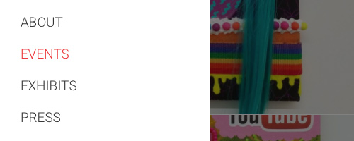
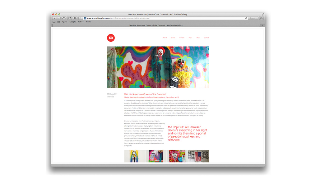
Although the site was heavy in terms of content, the navigation needed to be simple and minimal to highlight more important sections. Landing pages were made to drive the user in deeper but started with a very straightforward menu tree.
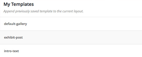
Using Wordpress Visual Composer, I was allowed to create templates for posts and pages for the client to reuse and fill in to create uniform blog posts, events, and landing pages. This made building content fast, easy, and approachable for inexperienced users.
STEP 2
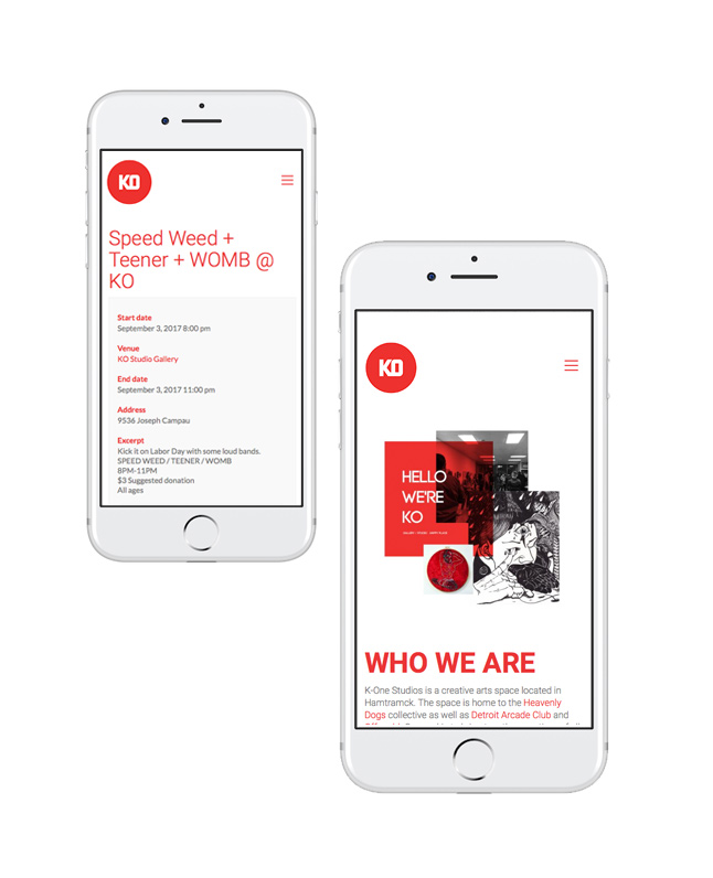
Emphasize mobile-friendly environment
Both client and designer anticipated that most of the site's traffic would be via mobile device. We assessed together that the site would be used primarily to look up events, locate contact information, and find the address. In conjunction with its simple navigation tree, the mobile design was clean, easy to use, and quick to load.
Pictured left, the events pages were easy to access, easy to read, and straightforward in design. Information was easy to view and locate for the user. Events pages included maps and driving directions.
There was also an emphasis on legibility in mobile. Fonts were large, high in contrast, and spaced for easy viewing for both page content and article content.

Desktop/Mobile views
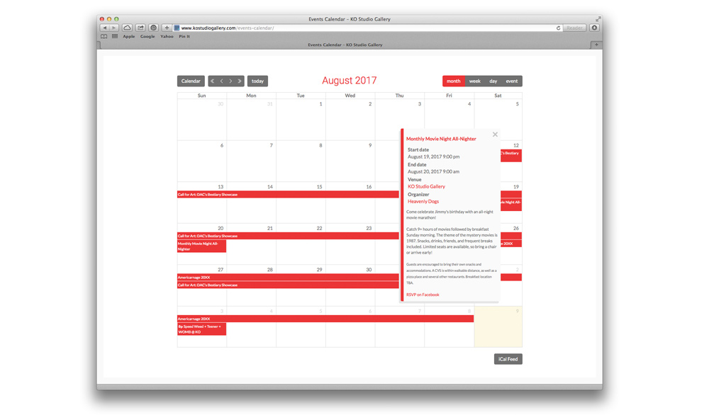
Calendar View
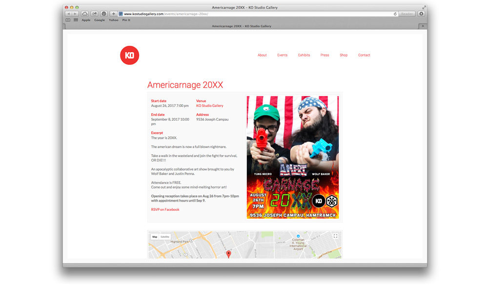
Single Event View